Week 1: The Alphabet of Art
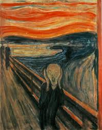
The first painting on the left is a very popular piece known as "The Scream." The curved lines in the background create contrast against the straight lines of the railing. In addition to contrast, the swirling curved lines create a whirling sense of no control. This may be why the man in the painting looks so scared.
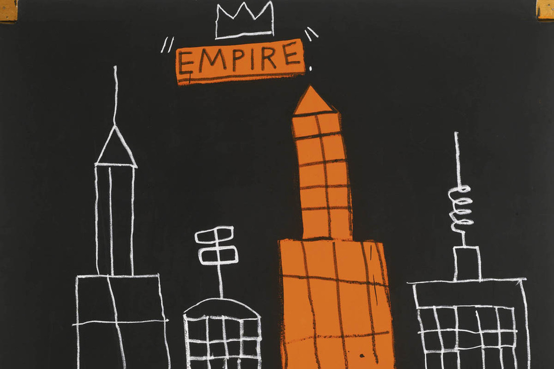
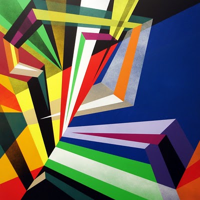
The second painting is called "Empire" and is much more simple. There is much less contrast displayed, as there is mostly only lines of the straight variety. The straight lines convey a sense of solidity and the permanency of towers and skyscrapers in New York.
The second painting is called "Empire" and is much more simple. There is much less contrast displayed, as there is mostly only lines of the straight variety. The straight lines convey a sense of solidity and the permanency of towers and skyscrapers in New York.
Week 2: The Alphabet of Art
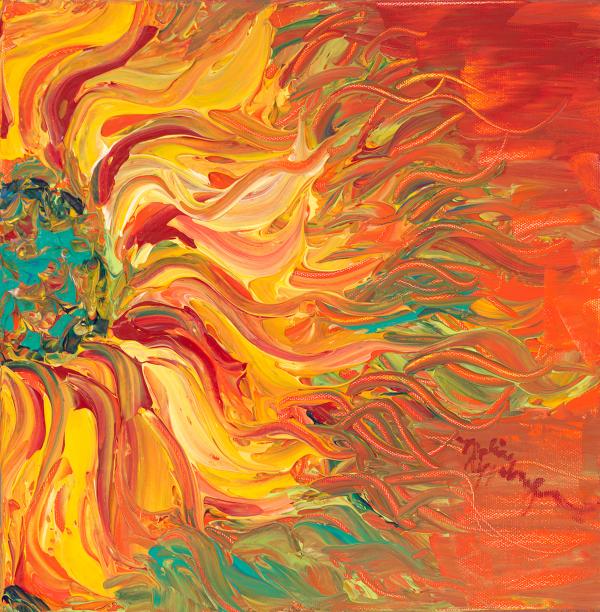
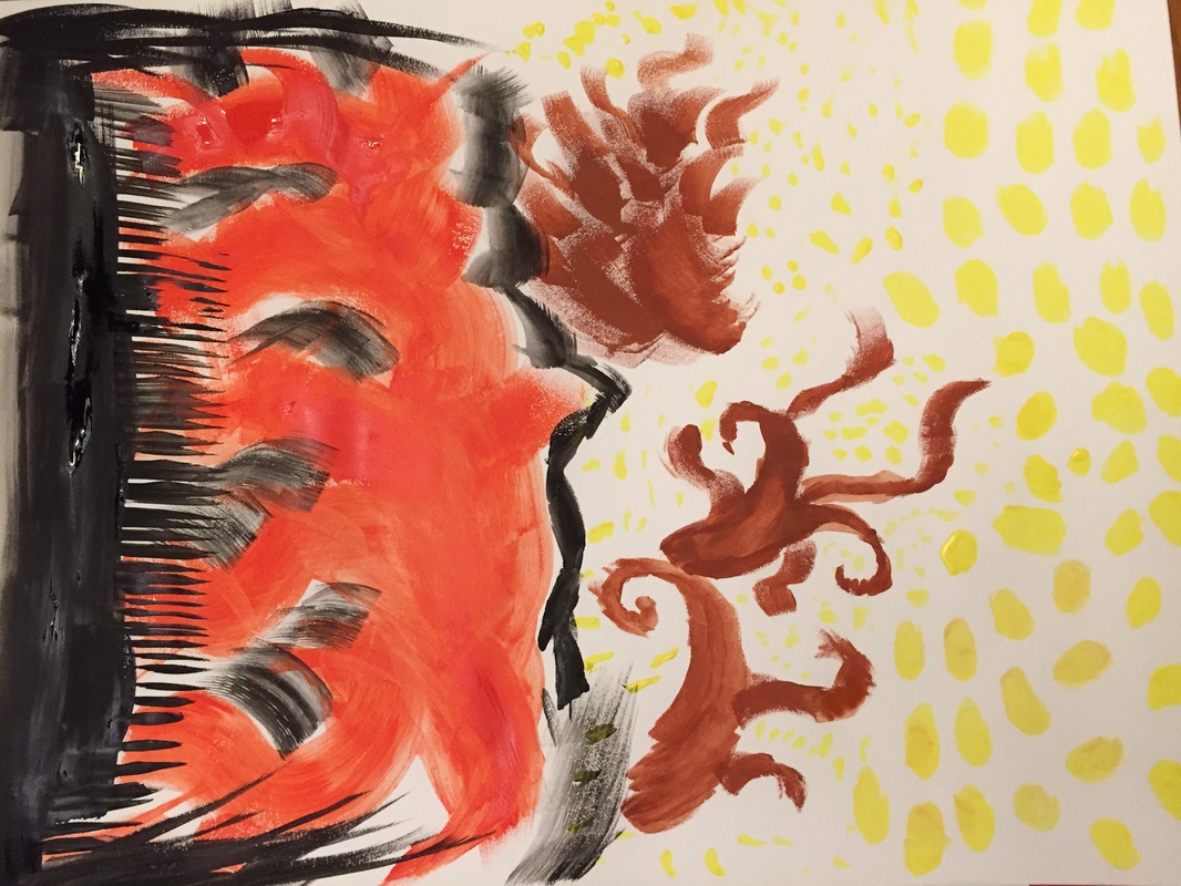
The first piece is called “Fire Sunflower” by Nadine
Rippelmeyer. I think it displays an excellent variety of textures from the
center of the flower, to the petals, and finally to the flames on the outside
of the flower. The center is mostly small strokes showing a more detailed texture
in comparison to the outside of the flower where the flames are. The flames are
made with longer strokes and have a broader texture, almost enveloping the
petals.
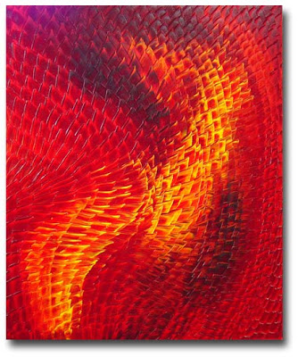
The second piece is titled “Mosaic Feline” and is more abstract than the first. The entire focus of this piece is on texture and the variation of texture throughout the landscape of the art. The yellow portions of the piece have a more glossy texture and I think that this is from longer strokes. Overall the straightness of the lines show the rigidness of the individual components of the whole piece, which I believe is a focus on a more solid and strongly-shaped texture.
The second piece is titled “Mosaic Feline” and is more abstract than the first. The entire focus of this piece is on texture and the variation of texture throughout the landscape of the art. The yellow portions of the piece have a more glossy texture and I think that this is from longer strokes. Overall the straightness of the lines show the rigidness of the individual components of the whole piece, which I believe is a focus on a more solid and strongly-shaped texture.
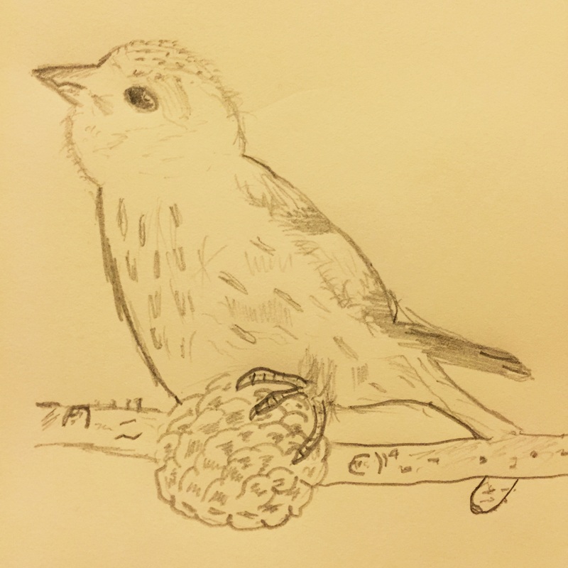
This is my art. In the original picture I liked that the bird had different textured feathers; ranging from long and glossy looking to almost seeming like a soft fur. I also enjoyed the texture of the pinecone in the original pictures, but didn't find out that I'm not very good at drawing pinecones until after I drew this one.
Week 3: The Alphabet of Art
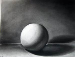
The first piece that I found does an excellent job of
displaying prominent shadowing. I selected it for this assignment mostly
because it reminded me of one of the drawings that we did this week. The sphere
does an excellent job of showing which side of the figure the light is shining
on and at what angle. This is obvious because of the difference in shading
between the top and bottom of the sphere. The lightness of the sphere also
creates contrast against the darkness of the shadow. This creates an environment
of maximum contrast, with high emotional activity.
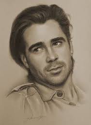
The second piece is called Gary, and also displays prominent shadowing. This is true all over the painting from the shadow cast by Gary’s nose, and the one cast from his jawline. While there is contrast in the varying darkness and light of Gary’s face, it is not as severe as in the first piece. This piece has more of a gray atmosphere, thus giving it minimal contrast, with low emotional activity.
The second piece is called Gary, and also displays prominent shadowing. This is true all over the painting from the shadow cast by Gary’s nose, and the one cast from his jawline. While there is contrast in the varying darkness and light of Gary’s face, it is not as severe as in the first piece. This piece has more of a gray atmosphere, thus giving it minimal contrast, with low emotional activity.
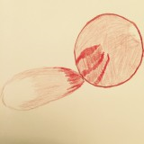
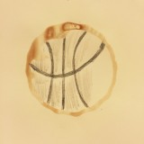
Finally, I have my art from this week. I tried to show high contrast on the sphere by changing the lighting in different parts of the figure. The coffee stain piece was fun, and I was stumped for a while before I decided to turn my stain into a basketball.
Week 4: The Alphabet of Art
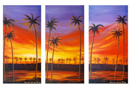
The first piece pictured is one that stood out to me because
of its relation to this week’s assignment. I thought that this painting not
only used a wide array of colors, but also focused on the sky. The oranges and
reds of the sky dramatically contrast with the dark silhouettes of the palm trees.
This contrast brings out the richness of the color of the sunset, and makes the
painting stand out.
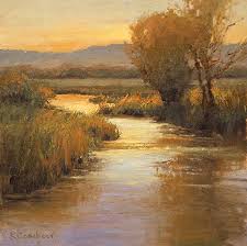
The second piece is a landscape painting of a stream in the middle of what seems to be a grassy plain. The first thing that I notice about the piece is the apparent tranquility of the scene. I think that this sense of peace is conveyed through the use of calm colors. Instead of bright greens for the grass and leaves, and blues and whites for the stream the painter uses less active colors like brown and grey in most parts of the painting. I think that the use of these less vibrant hues make the painting more peaceful.
The second piece is a landscape painting of a stream in the middle of what seems to be a grassy plain. The first thing that I notice about the piece is the apparent tranquility of the scene. I think that this sense of peace is conveyed through the use of calm colors. Instead of bright greens for the grass and leaves, and blues and whites for the stream the painter uses less active colors like brown and grey in most parts of the painting. I think that the use of these less vibrant hues make the painting more peaceful.
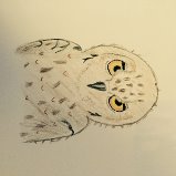
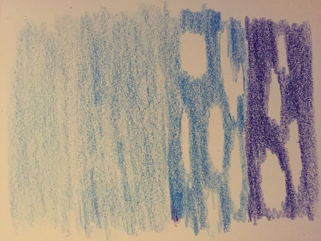
Here are my pieces from this week. The first is my owl, I tried to use lighter and darker shades to show the difference in color between all of the different feathers. For the second part I drew the sky at 4 different times throughout the day: 8:30 AM, about 11 AM, about 3 PM, and finally about 6 PM.
Week 5: The Alphabet of Art
|
The first piece is a great example of symmetry within art. It is clear that there is much less contrast in this piece than in the second one. This lack of contrast and emotional passivism is much more soothing to look at than that of an asymmetrical work.
|
This second piece is quite opposite the first. This work is an example of asymmetry. In symmetrical works there is a line of symmetry where the two sides are reflections of one another. In this painting, the line in separating the two portions of the piece is more like a line of asymmetry. This lack of symmetry makes a more contrasted, emotionally active spectacle.
|
This is my painting. I was inspired to make this work of art while listening to "Yulunga" by Dead Can Dance. This was the first time I had listened to this musical piece, as I am not very familiar with the Muslim Peace/Prayer genre that I stumbled upon.
Week 6: The Alphabet of Art
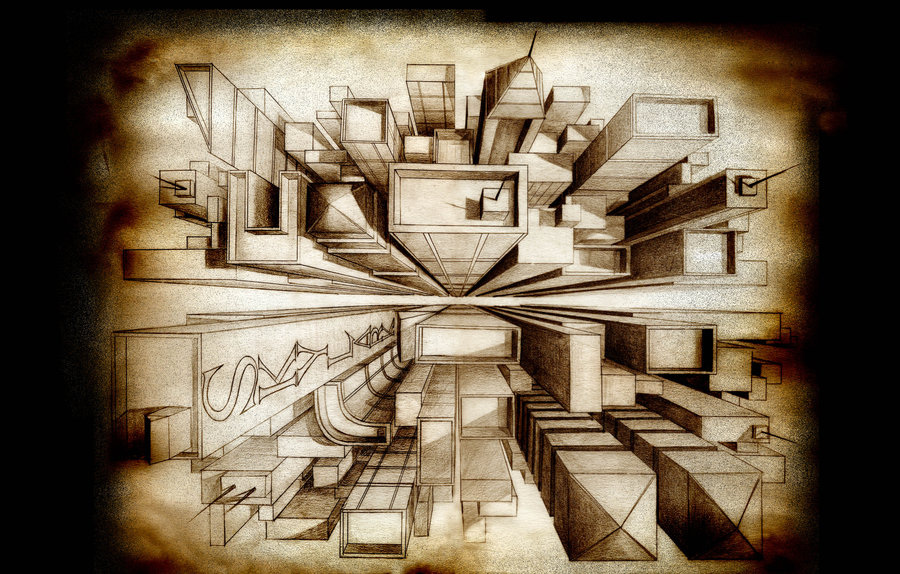
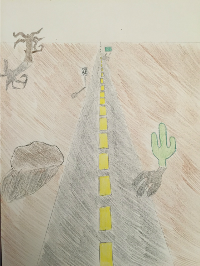
The first image is found is a great example of one-point perspective drawing. I found that most perspective drawings found online are of cities or streets. The first image pictured stuck out to me because of the view that the drawing is captured from. Like the second picture I chose, most perspective drawings are from ground level, but this single-point perspective drawing is from the top, which I thought was unique.
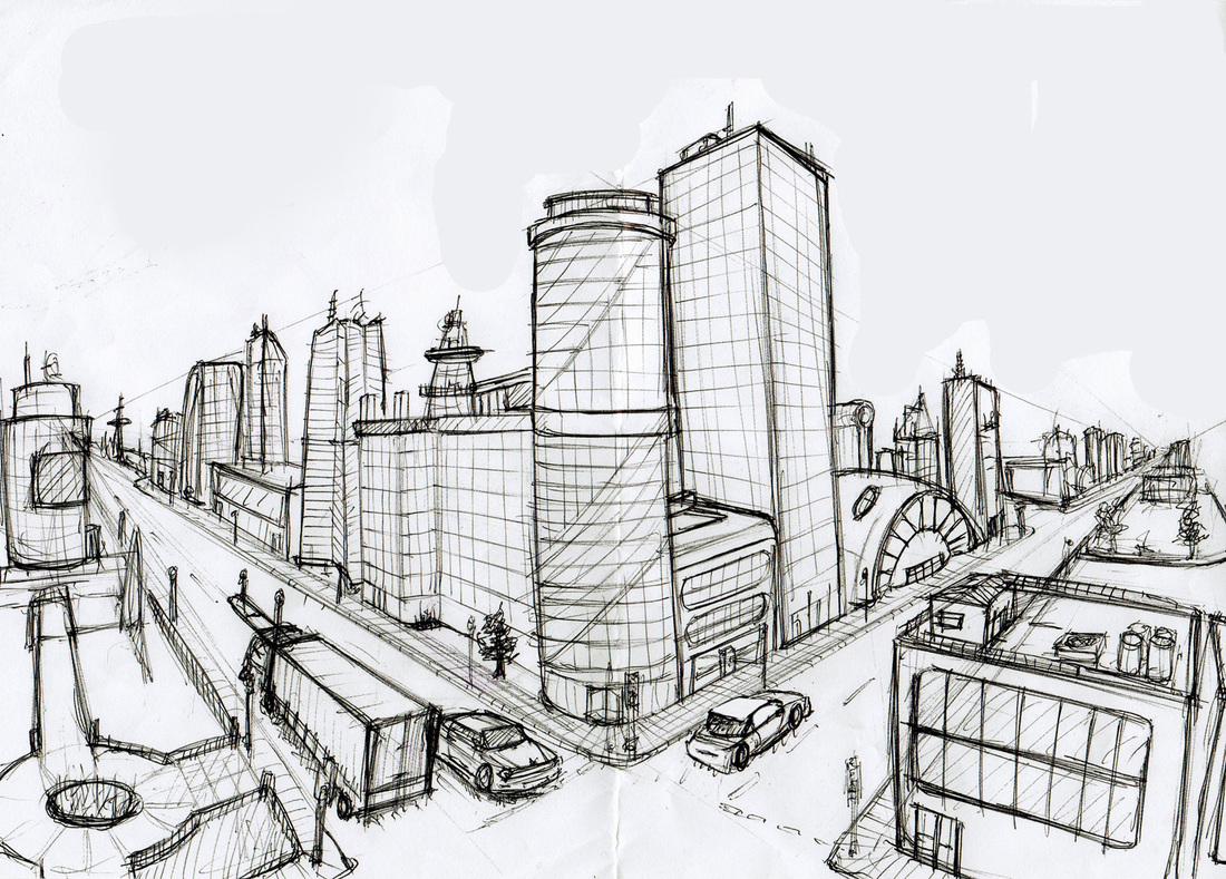
The second image pictured is a two-point perspective drawing. Like the first, this is also of a city but from the traditional street level view. Unlike the first drawing, this two-point perspective drawing shows two different sides of one view. This is allows the viewer to see two different directions on the same plane. Unlike a single-point perspective drawing, that only lets the viewer see one view.
The second image pictured is a two-point perspective drawing. Like the first, this is also of a city but from the traditional street level view. Unlike the first drawing, this two-point perspective drawing shows two different sides of one view. This is allows the viewer to see two different directions on the same plane. Unlike a single-point perspective drawing, that only lets the viewer see one view.
Week 7: The Alphabet of Art
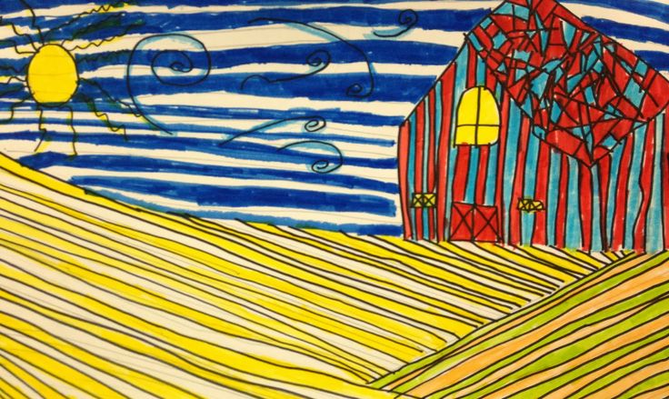
After looking for art using the strategy of line direction I found these two pieces. Both of these drawings use diagonal lines mostly and also add some horizontal or vertical lines for contrast. The drawing on the left doesn't limit itself to solely directional lines, and even has some curly lines in the upper portion of the sky, and jagged lines coming off of the circular sun. This different variety of line is what makes the left piece different than the one on the right.
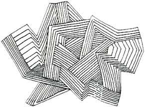
The second drawing is also a great example of directional line art. As you can see, it is quite different from the first piece due to its lack of color and strictly straight lines. .While the first piece is more colorful and vibrant, it is less emotionally active than the black and white art. This is because of the strictly diagonal lines used in the drawing on the right. Diagonal lines such as those found in the right piece are responsible for making the piece more emotionally active and esthetically decorative as a whole.
The second drawing is also a great example of directional line art. As you can see, it is quite different from the first piece due to its lack of color and strictly straight lines. .While the first piece is more colorful and vibrant, it is less emotionally active than the black and white art. This is because of the strictly diagonal lines used in the drawing on the right. Diagonal lines such as those found in the right piece are responsible for making the piece more emotionally active and esthetically decorative as a whole.
Week 8: The Alphabet of Art
This week's focus was on size and I thought that this first painting is a good example of large size art. The dog is made of large shapes and long lines, making a very emotionally active piece. In addition the first drawing is much more spatially in depth than the second drawing, and this is a direct result of the largeness of the art opposed to the smallness of the second piece.
The second piece is also a great example of using size in art. As you can see, there is much more fine detail put into the second painting. This is visible in the small circles and miniscule markings on the scales. These details make an emotionally passive piece as a whole, and also contribute to the spatially static elements of the piece.
The second piece is also a great example of using size in art. As you can see, there is much more fine detail put into the second painting. This is visible in the small circles and miniscule markings on the scales. These details make an emotionally passive piece as a whole, and also contribute to the spatially static elements of the piece.
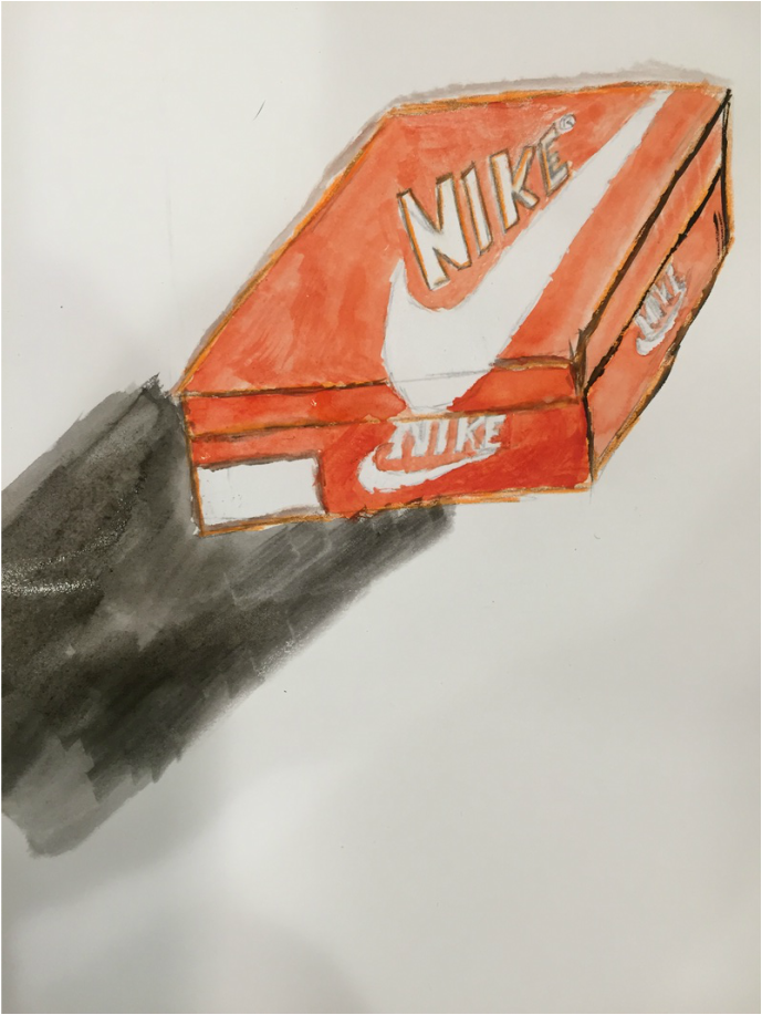
Finally is my work from this week. I tried to emphasize different shades and values through the simple subject of a retro Nike shoe box. I did the outline in graphite pencil and colored pencil and then finished it with a watercolor gouache in order to show the different shading throughout the box based on how the light was cast on it.
Week 9: The Alphabet of Art
This week the focus was on sketching compared to methodical drawing. While this week was probably my most difficult week for searching for examples, I think that I found two good representations of sketches that turned into something more complete.
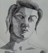
The first two pictures are a sketch, and then a drawing. The first is a shapeless, sketched face with no real defining features or characteristics. The second face is certainly a more polished product. There are many more details added to the original, and these details create a complete work of art.
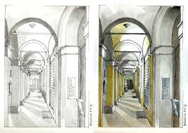
The third picture is also an example of a sketch turned into a drawing or painting. For the second example I thought it would by best to use something outside of a person, although almost all of my searching led me to sketches of people. This piece is of a hallway and in the first sketch it is noticeable that there are many details missing. Color is an obvious missing trait, in addition, the more refined side of the piece on the right also has shading. Both of the sketches pictured help shape the complete piece, but lack the detail needed to be called complete themselves.
The first two pictures are a sketch, and then a drawing. The first is a shapeless, sketched face with no real defining features or characteristics. The second face is certainly a more polished product. There are many more details added to the original, and these details create a complete work of art.
The third picture is also an example of a sketch turned into a drawing or painting. For the second example I thought it would by best to use something outside of a person, although almost all of my searching led me to sketches of people. This piece is of a hallway and in the first sketch it is noticeable that there are many details missing. Color is an obvious missing trait, in addition, the more refined side of the piece on the right also has shading. Both of the sketches pictured help shape the complete piece, but lack the detail needed to be called complete themselves.

Week 10: The Alphabet of Art
This painting is one of my favorite paintings that I found while searching online. In my opinion, the artist in this painting did a great job at using different elements together to make a very colorful and intriguing piece. The first element that sticks out to me as an observer is that of emotion. I believe that the painting is very emotionally active due to the evident contrast within all of the fine details of the piece. I think that there is also a certain spatial element to this painting as well due to the in depth colors and brushstrokes.
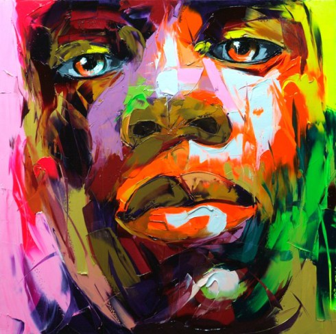
In this piece I believe that the artist is trying to portray the face of someone who may seem unaffected by the environment around him due to his neutral facial expression, but clearly is aware of the adversity in his life as shown by the different colors seen on his face. I think the colors represent struggles and events that the subject is going through while his straight face is a sign of strength while going through these struggles. The artist does a great job conveying this message to me at least, I'm sure other viewers may see something different in this piece as well.
In this piece I believe that the artist is trying to portray the face of someone who may seem unaffected by the environment around him due to his neutral facial expression, but clearly is aware of the adversity in his life as shown by the different colors seen on his face. I think the colors represent struggles and events that the subject is going through while his straight face is a sign of strength while going through these struggles. The artist does a great job conveying this message to me at least, I'm sure other viewers may see something different in this piece as well.
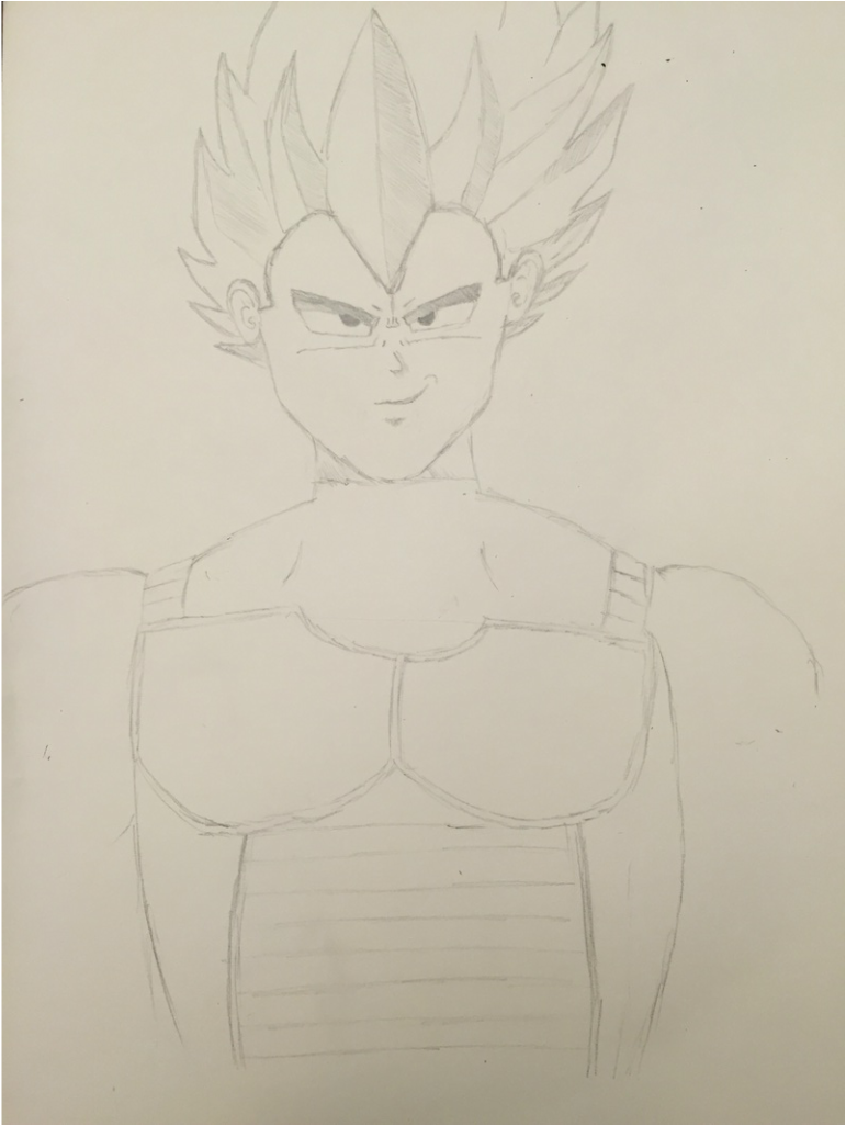
This is my personal piece for the week. I drew an anime character named Vegeta from the cartoon Dragon Ball Z. I used to love drawing anime characters when I was younger and thought I would make one for this final assignment where we got to choose what to make. I always thought it was cool how big and unrealistic all of the characters hair were, so I really tried to go all out with Vegeta's.
Art Exhibition Critique
For my Art Exhibition Critique, I attended the Fine Arts Center in Port Angeles. More specifically, I toured the outdoor exhibit and observed various different pieces. I loved the experience because I like to be outdoors and it was nice to be able to get fresh air while looking at the various different types of unique art displayed on the trails. Some of the pieces were somewhat hidden, which added another dimension of enjoyment to the art-viewing process as it was something of a scavenger hunt to observe certain works.
Out of the many sculptures, arrangements, and carvings along the nature trails I chose three pieces to sketch. The three weren't necessarily my favorite works that I saw on my walk, but certainly stuck out to me. I tried to critique three different varieties of art available as well. Instead of choosing three of the same types of work, I chose a sculpture, a painted piece, and a carving to sketch and write comments about.
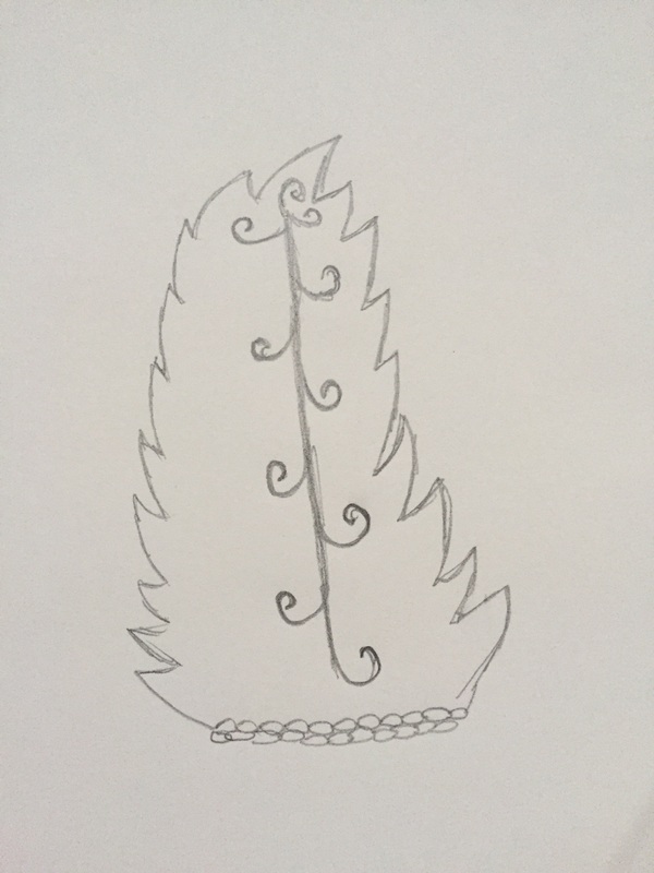
The first of the three pieces I am critiquing is a stone carving of a fern leaf. It is one of the first structures I encountered on my walk and that is probably why it stuck out to me so abruptly. I was immediately impressed with the detail of the swirling vein that goes down the middle of the piece. Although it is not depicted in my sketch, the swirling portion of the piece is a teal color that contrasts nicely with the dark, earthy color of the stone itself. I also liked the sideways lean of the sculpture, making it seem more realistic, as it isn't often that one sees a fern leaf standing straight up.
Out of the many sculptures, arrangements, and carvings along the nature trails I chose three pieces to sketch. The three weren't necessarily my favorite works that I saw on my walk, but certainly stuck out to me. I tried to critique three different varieties of art available as well. Instead of choosing three of the same types of work, I chose a sculpture, a painted piece, and a carving to sketch and write comments about.
The first of the three pieces I am critiquing is a stone carving of a fern leaf. It is one of the first structures I encountered on my walk and that is probably why it stuck out to me so abruptly. I was immediately impressed with the detail of the swirling vein that goes down the middle of the piece. Although it is not depicted in my sketch, the swirling portion of the piece is a teal color that contrasts nicely with the dark, earthy color of the stone itself. I also liked the sideways lean of the sculpture, making it seem more realistic, as it isn't often that one sees a fern leaf standing straight up.
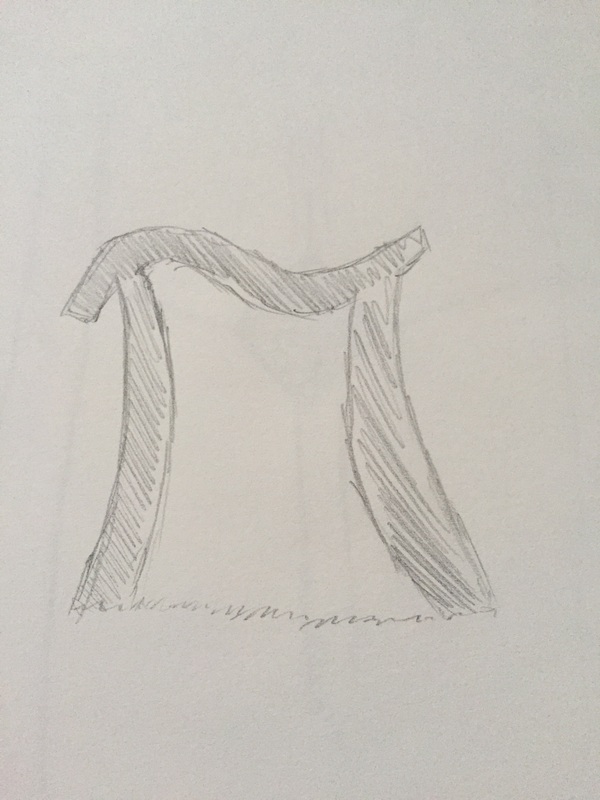
The next piece I am choosing to critique is a statue of the pi symbol. Based on its size, it seems as if it is meant to be somewhat of a doorway however the location in which it is placed in the exhibit doesn't really allow the piece to be used as one. This style of arrangement is one thing that I am critical of, but at the same time in the context of the other pieces throughout the exhibit, the randomness of the piece's placement fits quite well. One thing I was fond of in this pieces was the metallic appearance, which contrasted well with the green and leafy environment around it.
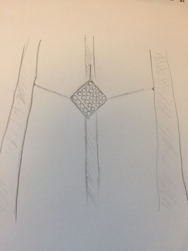
Finally, the last piece that I will be critiquing is somewhat hard to categorize. This one, while not as impressive in terms of craftsmanship stuck out to me because I had to look twenty feet above where I was standing to find it. I was walking along the trail, and look up to see a large red square suspended by wires. Inside the square there are twenty-five, neatly cute circles evenly spaced. Inside the circles there is a yellow color as the other side is a replica of the first, but with yellow paint instead of red. There is about an inch or two of space between the two squares, so the entire piece gets a multicolored appearance when viewing it from the correct angle. There are many things that I like about this piece but the one thing that is most prominent in my mind is the arrangement of it. I think it's funny that such a bright and shiny piece could go unnoticed if I didn't look up. Such a bright and shiny piece would typically draw viewers' eyes to it immediately were it down at eye-level, but suspending it high above the heads of those walking on the trails is genius in my opinion.